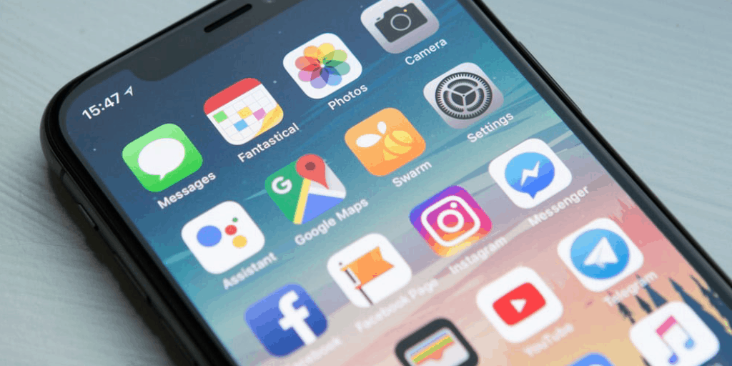
Mobile vs Desktop how content changes
Mobile vs Desktop how content changes: the increasing use of mobile devices for searching for information has changed the way content must be created not only to optimize search engine rankings, but also to better interact with mobile users .
Mobile vs Desktop: how content changes. That is, should the content differ? It is a question that lends itself to various reflections.
The growing use of mobile devices first forces us to understand how to better interact with mobile users.
How? By rethinking how content is to be presented (as well as producing more visual forms of content such as infographics, etc.).
If your content is not “mobile ready” you are less likely to be seen and found by your audience, even compared to just one year ago.
But to the question: Mobile vs Desktop how does the content change? The answer is no and let’s see why.
Content offered
The content offered to both mobile and desktop users should be nearly identical, except how it is presented. But if we admit that mobile and desktop content must be the same, then writing for mobile devices changes the way we write for the web.
Presentation
One of the key differences in desktop versus mobile content is the presentation of the content. Desktop screens are much larger and can display far more content at the same time than can be done on a smartphone.
If you’ve written with your visitors in mind and focused on what information is needed to create a great user experience, changing content for mobile only is unreasonable. On the other hand, if you’ve written your content with SEO in mind, without really considering what your visitors need, it’s just as foolish to put that content on your mobile site or desktop site.
The content developed for your visitors is the content they need, regardless of the device. But when we need to modify content for mobile audiences, we need to use what we learn about the usability of mobile content and apply it to the desktop as well.
Make desktop content more mobile-like
Scrolling with the mouse on a desktop or mobile is quite simple. But on a mobile device, scrolling isn’t that easy.
Let’s look at a Wikipedia page from a desktop – it looks like a typical page with tons of content. But when we view the same page on a mobile device, we see some pretty significant differences.
On the surface, it might appear that the page has less content, but it doesn’t. It’s just that the content is split into an accordion menu, making it available on command.
Presenting chunked content for mobile users is a great way to reduce the amount of scrolling needed by giving readers the opportunity to see what content they are most interested in reading. Those content blocks represent specific blocks of information that can be read in any order because each section is, essentially, a self-contained chapter.
Instead of using headings to break up your content, break it down so that each section becomes self-contained like the Wikipedia page above. This is what really works for mobile, so let’s apply it to the desktop too.

Reduce the value of content by increasing that of visitors
One of the arguments put forward against SEO is that it requires too much content on the page to optimize it. It is wise to do what is best for the visitors. If we’re concerned about the amount of content visible on a single page, let’s put it aside and focus only on the amount of content needed to provide visitors with the information they need.
This could be a paragraph, which could contain several paragraphs depending on the page. We don’t think about the amount of content on each page. Instead, let’s focus only on the value of the content. We keep what is precious and leave the rest.
Other
Ultimately, if the content is “too much” for the page, we can make some of this content available on demand in a similar way to how mobile devices use chunking.
This is usually a problem on product category pages. You want to make sure your first row of products ends up above the fold (on the viewable page before scrolling). If the text pushes the content too low, we need to cut it.
On the desktop, you can do this in several ways. The simplest is to display a paragraph or two of content with a call to action to “keep reading” or “read more”. When clicked, the rest of the content is displayed, pushing the rest of the page information down. This allows the reader to read the content if needed, or they can skip it by keeping it closed and get the products directly.
In conclusion, the web is constantly evolving and the way we write and present content must evolve with it. While we present information differently between devices, it doesn’t mean that we have to present different information but that new technologies must affect old ways of doing things, even when using those old technologies.
We need to change the old way of thinking and writing our content for the new generation of devices. Mobile sites need to be easier to use than desktop devices – we adopt for the desktop what works for mobile devices.
READ MORE
-
 Content creation? How to be first on Google with SEO- 08/09/19
 -
 How to write content for the website- 04/11/19
 -
 The content must be optimized for mobile. Let’s find out how!- 04/11/19
 -
 Do you want to know what the ideal structure of a website is?- 04/11/19
 -
 Increasing the visibility of a website is possible by opening a blog- 04/11/19
 -
 How to write content for website promotion on Google Ads- 04/11/19
 -
 Why is content on a website so important?- 26/11/19
 -
 How to improve website performance- 28/11/19
 -
 Improve the indexing of the website with the blog- 03/12/19
 -
 All the ways to increase website visitors- 05/12/19
 -
 Structure and form: optimization of the mobile website- 10/12/19
 -
 How important can an optimized mobile app be for your company?- 17/12/19
 -
 Increase your mobile app downloads? Here’s how to do it- 19/12/19
 -
 Not just a website: the mobile app can be one of the tools to increase the visibility of your company- 24/12/19
 -
 Web Agency- 13/04/22
 -
 Mobile App Developers- 20/04/22
 -
 Create mobile apps- 25/04/22
 -
 Importance of mobile apps- 26/04/22
 -
 What is the effective structure of a mobile app- 12/09/22
 -
 How to get the user’s attention through content- 26/04/22
 -
 The basic rules for writing content- 26/04/22
 -
 Sponsor your site: how the content posted can help you- 26/04/22
 -
 How to create an effective editorial plan to increase visits- 26/04/22
 -
 How does site speed affect indexing?- 25/04/22
 -
 The 2 principles that make desktop browsing easier- 24/04/22
 -
 Smart Working, funding opportunities- 20/04/22
 -
 iOS and Android how to create an app- 18/04/22
 -
 Promote your mobile app: here are the useful tools- 15/04/22
 -
 Telemaco case history mobile app- 15/04/22
 -
 Content and SEO to be successful with your website- 14/04/22
 -
 How content marketing for service companies can be helpful- 14/04/22
 -
 3 Elements to Keep in Mind When Creating Content for the Website of your client- 12/04/22
 -
 Content creation for mobile! The rules to follow.- 08/04/22
Latest contributions


Services
-
 Mobile ApplicationsDeveloping quality mobile applications isn't easy at all. Find out how to take this opportunity.
 -
 Websites developmentThe websites development service allows you to get the development of high quality websites and cloud applications. Find out more...
 -
 Marketing and CommunicationDiscover the professional Marketing and Communication services: Social Media Marketing, Google Ads and Search Engine Optimization (SEO).
 -
 Content Marketing & Content CreationContent Marketing, with the creation of specific content, is fundamental in maximizing the quality of the User Experience and SEO.
 -
 Technological PlatformsTechnological Platforms for Domain Management, DNS, Email, Hosting and Database Management
 -
 European Calls for Digital TransformationThe European calls for digital transformation represent important opportunities for companies in the digital sector.
Webateca (Web Agency Technical Angel) is a “digital factory”, a qualified B2B supplier of Web Agency, Software House, Communication Agencies and Freelance with the aim of offering services such as website and app creation, customized software development, solutions of communication and design to companies that are not structured to follow these activities or that have a momentary moment of operational difficulty.
Menu
Social


Contact us
Telemaco Srl | © 1995-2019 | PI & CF: 04658880481 | REA Firenze: 0468609 | Share capital: Euro 30,600.00 i. v.
Telemaco Srl. Project co-financed / financed by the POR FESR Toscana 2014-2020